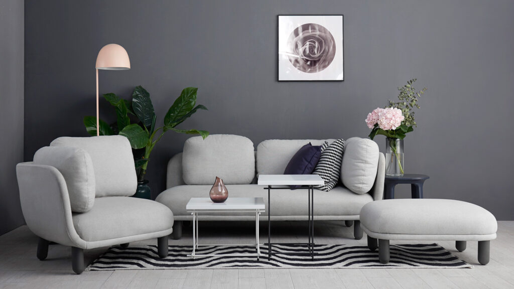
In interior design, fashion design, and graphic design, people talk about “advanced gray.”
Taken literally, advanced gray means this: if you use a lot of gray tones in a design, the work somehow acquires an intimidatingly sophisticated feel.
Actually, “advanced gray” does not refer only to gray. It really means a hazy, muted look—in other words, colors with relatively low saturation. When white paint is mixed into pure-color paint, the result is a shade that is a little paler than the intense pure color, slightly whitish and grayish. That is “advanced gray.”
I have always had one question: why does advanced gray seem sophisticated?
Colors themselves have no high or low status, but viewers have their own minds. My guess is that, among the population, some people genuinely like this kind of “advanced gray.” These people are generally seen as having particularly sophisticated taste, so the colors they like naturally become sophisticated colors too.
So, who is more likely to like advanced gray?
From my own observations, the people who like advanced gray seem to be, for the most part, artists, designers, white-collar workers and university students in first-tier cities. Advanced gray seems to go with a group of people who have received higher education and aesthetic education, and who live relatively comfortable lives. This group does, in fact, seem to be the kind of people most of us usually consider to have “sophisticated” taste.
So what is the psychological mechanism behind this group’s liking for “advanced gray”?
A study published years ago in Journal of Experimental Psychology: General offers us a little insight.
In this paper, the researchers examined the emotional responses elicited by different colors. To measure emotion, the authors used the then-popular three-dimensional model of “pleasure–arousal–dominance.”
Pleasure refers to whether something feels positive or negative, pleasant or unpleasant.
Arousal refers to whether something gets you excited: after seeing it, do you become more excited and alert, or calmer and more at peace?
Dominance refers to whether something makes you feel in control, superior, and able to take charge—or leaves you feeling out of control. Anger and fear, for example, are both negative emotions, but anger is high in dominance (you feel like picking a fight), while fear is low in dominance (you feel like running for your life).
Put more simply, these three dimensions of emotion are: “Am I happy?”, “Am I agitated?”, and “Do I feel steady and in control?”
So what does unsaturated “advanced gray” feel like on these three dimensions? The paper’s findings were—
1. “Am I happy?” Saturated colors make people happier; the feelings elicited by unsaturated colors are somewhat more neutral.
2. “Am I agitated?” Saturated colors make people more excited; unsaturated colors make people calmer.
3. “Do I feel steady and in control?” Saturated colors give people a stronger sense of control; unsaturated colors give them less.
Taken together, the emotional experience of unsaturated “advanced gray” is: neither happy nor sad, calm, and low in perceived control.
What does this tell us?
We should notice that, in most cases, people tend to like whatever they lack. Emotions probably work the same way: going too far in any one emotional direction is bad, and balance is needed. Take interior decoration. After working hard all day, when you return home to this safe harbor, you may really need to pull the emotions stirred up during the day in the opposite direction.
So we need to think in reverse here: people who like advanced gray should be a group of people who—
1. Are relatively satisfied with life (they are not short on positive emotions),
2. Have a relatively fast-paced life or active, quick-thinking minds (life is already plenty agitated),
3. Feel in control of their lives
—that is, people who meet these conditions.
Such people need the neutrality, calm, and low sense of control offered by advanced gray to balance their usual emotional state.
Based on your own observations, do you think people who like advanced gray fit these three characteristics? Or, put another way, do people who dislike advanced gray (some people simply love flashy gold) lack any one of the traits above?
References:
Valdez, P., & Mehrabian, A. (1994). Effects of color on emotions. Journal of Experimental Psychology General, 123(4), 394-409.
Note
- This article in the “New Psychology Knowledge Mini-Lessons” series was written at the time to accompany content related to Zhichao Wei: New Psychology Knowledge Course. It was a short popular-psychology essay/commentary piece published on the now-closed platform Fatuan; the original link no longer exists.
Leave a Reply